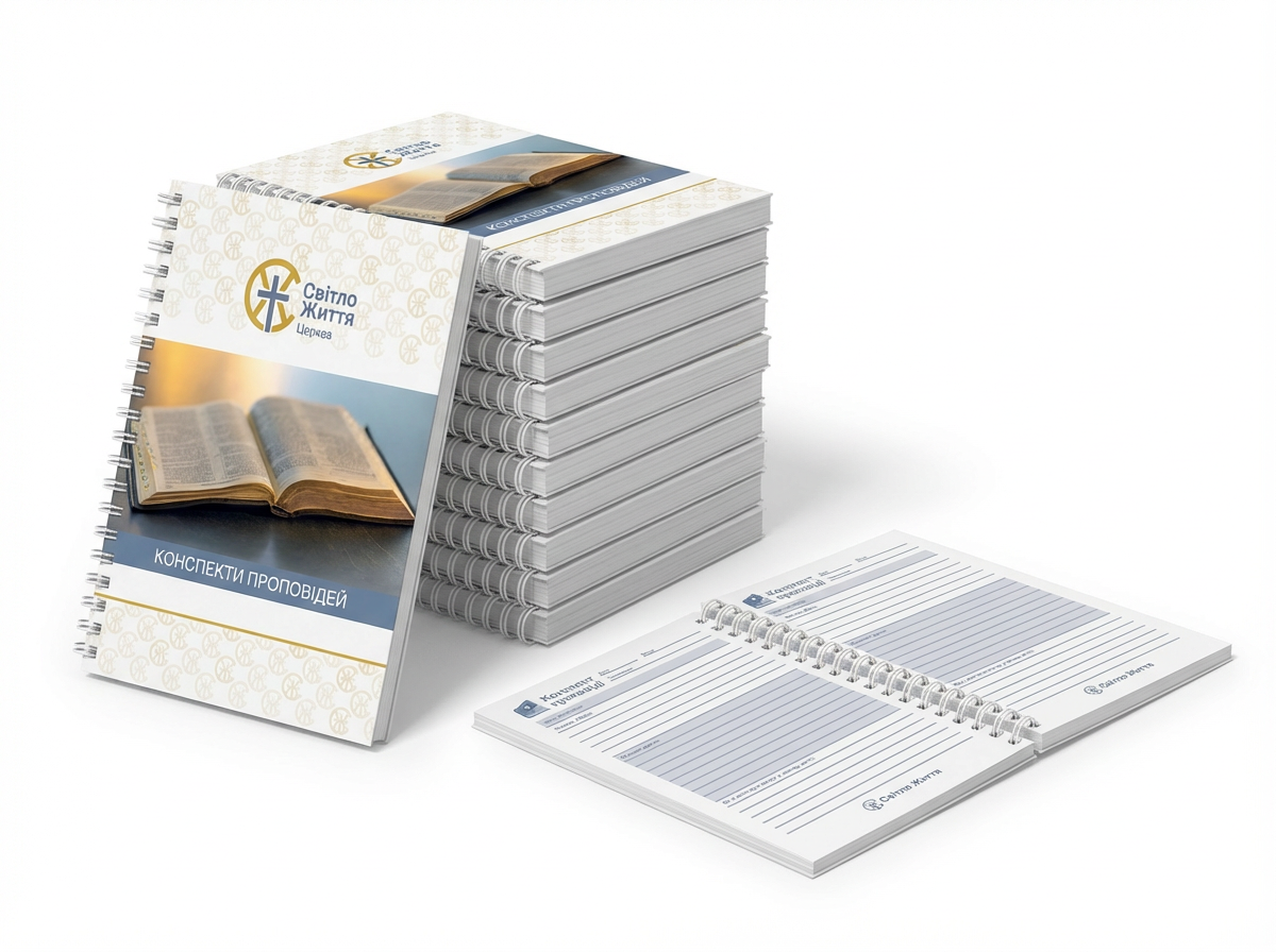
The logo for Light of Life Church transforms familiar Christian symbols into a unique visual identity.
Built from the church’s initials — C and Zh — it merges faith and form into a single, harmonious structure.
The Zh reveals the Cross, with diagonal lines alluding to the Spear and the Reed with the sponge. The C gently encloses the composition, forming a circle of unity — a stylized crown of incorruption.
Between the letters, the negative space radiates outward from the center of the Cross, symbolizing light spreading from within.
The result is a logo that feels timeless yet distinctive — minimal, balanced, and geometrically precise, guided by proportions the eye instinctively recognizes as harmonious.